Theming
Our prebuilt components are customizable so you can make them fit with the theme of your application.
UploadButton Anatomy
Simplified component structure:
<div className={className} data-state={}>
  <label
    data-ut-element="button"
    data-state={/* "ready" | "readying" | "uploading" */}
  >
    <input />
    /button content goes here/
  </label>
  <div
    data-ut-element="allowed-content"
    data-state={/* "ready" | "readying" | "uploading" */}
  >
    /allowed content text goes here/
  </div>
</div>
UploadButton consists of three themeable elements: container, button, and
allowed content.
label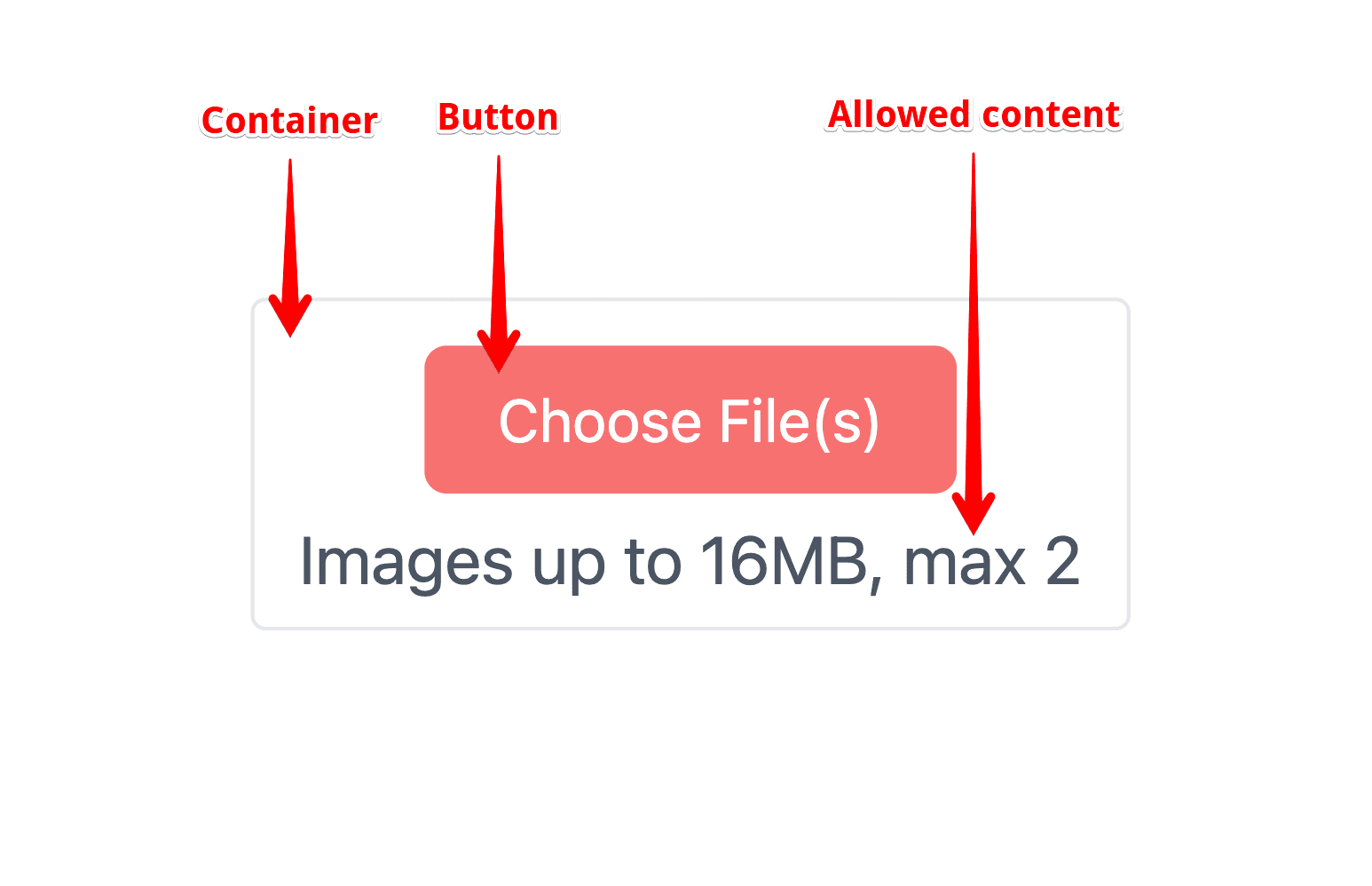
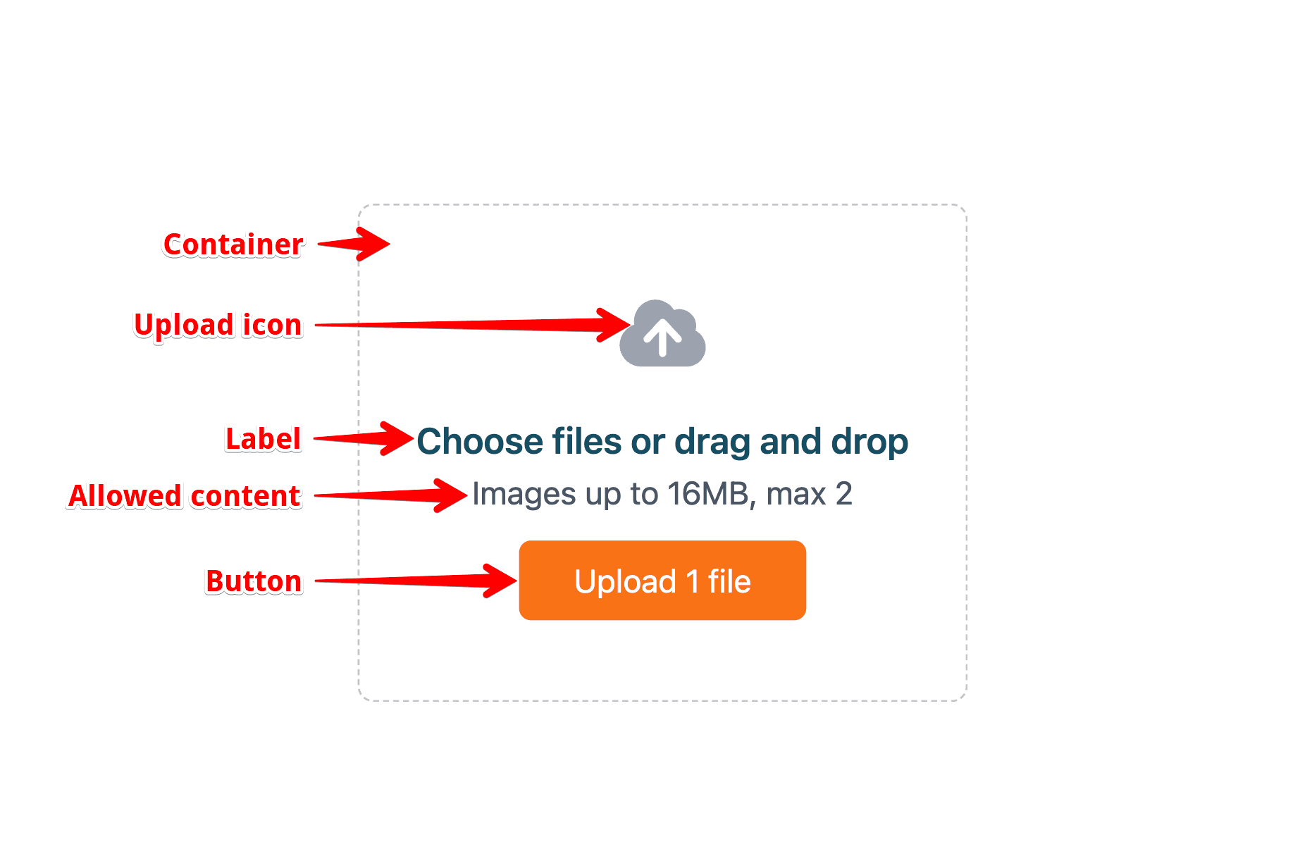
UploadDropzone Anatomy
Simplified component structure:
<div className={className} data-state={/* "ready" | "readying" | "uploading" */}>
  <svg data-ut-element="upload-icon" data-state={/* "ready" | "readying" | "uploading" */}>
    ...
  </svg>
  <label data-ut-element="label" data-state={/* "ready" | "readying" | "uploading" */}>
    {/* label content goes here */}
    <input disabled={!ready} />
  </label>
  <div data-ut-element="allowed-content" data-state={/* "ready" | "readying" | "uploading" */}>
    /allowed content goes here/
  </div>
  <button
    data-ut-element="button"
    data-state={/* "ready" | "readying" | "uploading" */}
    disabled={isUploading}
  >
    {/* button content goes here */}
  </button>
</div>
UploadDropzone consists of five themeable elements: container, upload icon, label, button, and allowed content.
Note: While in UploadButton the button element is defined using label, in
UploadDropzone it is defined using button. As an abstraction layer, the
button element in these two components has a special data attribute applied:
data-ut-element="button".
Theming props
className
Both UploadButton and UploadDropzone accept a className prop. It allows you to
pass any additional classes to the component. All classes that are being passed
through this prop are going to be applied to the outermost element -
container.
appearance
Both UploadButton and UploadDropzone accept an appearance prop. It accepts
an object with keys that correspond to elements of a component. The interfaces
for the appearance prop for UploadButton and UploadDropzone are:
type StyleField =
  | string
  | CSSProperties
  | ((args: CallbackArguments) => string | CSSProperties);

type UploadButtonProps = {
  /* rest of props */
  appearance?: {
    container?: StyleField;
    button?: StyleField;
    allowedContent?: StyleField;
  };
};

type UploadDropzoneProps = {
  /* rest of props */
  appearance?: {
    container?: StyleField;
    uploadIcon?: StyleField;
    label?: StyleField;
    allowedContent?: StyleField;
    button?: StyleField;
  };
};
where the CallbackArguments is defined as (depending on the component):
type ButtonCallbackArguments = {
  ready: boolean;
  isUploading: boolean;
  uploadProgress: number;
  fileTypes: string[];
  files: File[];
};

type DropzoneCallbackArguments = {
  ready: boolean;
  isUploading: boolean;
  uploadProgress: number;
  fileTypes: string[];
  isDragActive: boolean;
  files: File[];
};
For Signal-based frameworks, such as
Solid.js ↗, the
attributes of the interfaces are getter-methods. For example, the
ButtonCallbackArguments.ready: boolean property is a getter-method
ButtonCallbackArguments.ready(): boolean in Solid.js.
Theming with TailwindCSS
If some classes are not working as expected, you may have to override the
default class merger to use something like tailwind-merge ↗:
import { twMerge } from 'tailwind-merge'
import { UploadButton } from '~/lib/uploadthing'

export function Page() {
  return (
    <UploadButton
      ...
      config={{ cn: twMerge }}
    />
  )
}
Configuring TailwindCSS
To leverage the best developer experience, we strongly recommend wrapping your
Tailwind config with our utility function withUt. This utility function adds
additional classes and variants used to style our components.
In addition, it also automatically sets the content option to include all the
necessary classes that the components use. This allows you to avoid having
duplicated styles in your bundle. Therefore, when using withUt, you should not
import our stylesheet into your app. If you choose not to use withUt, you have
to import the default stylesheet to make the components look right.
import { withUt } from "uploadthing/tw";

export default withUt({
  // your config goes here
});
If you're not wrapping your config as shown above, you have to import our stylesheet into your app. Otherwise, components will not look right.
import "@uploadthing/react/styles.css";

// ...
Style using the className prop
className accepts any classes and will merge them using tailwind-merge,
meaning you can pass any class you like and it will be applied correctly,
overriding the default styles if necessary.
The withUt wrapper adds custom variants that you can leverage to easily target
different elements of the component and its state:
| Variant | Description |
|---|---|
ut-button: | Applied to the button element. |
ut-allowed-content: | Applied to the allowed content element. |
ut-label: | Applied to the label element. |
ut-upload-icon: | Applied to the upload icon element. |
ut-readying: | Applied to the container element when the component is readying. |
ut-ready: | Applied to the container element when the component is ready. |
ut-uploading: | Applied to the container element when the component is uploading. |
If you're not using the withUt wrapper, the state variants can be applied
using data-[state="..."]:
These variants and classes can be used in conjunction with each other to make component match your design in the exact way you want.
<UploadButton
    className="mt-4 ut-button:bg-red-500 ut-button:ut-readying:bg-red-500/50"
               |    └─ applied to the button └─ applied to the button when readying
               └─ applied to the container
/>
<UploadDropzone
    className="bg-slate-800 ut-label:text-lg ut-allowed-content:ut-uploading:text-red-300"
               |            |                └─ applied to the allowed content when uploading
               |            └─ applied to the label
               └─ applied to the container

/>
Style using the appearance prop
If you're not using the withUt wrapper, or prefer splitting your styles up a
bit, you can use the appearance prop to target the different elements of the
component.
<UploadButton
  appearance={{
    button:
      "ut-ready:bg-green-500 ut-uploading:cursor-not-allowed rounded-r-none bg-red-500 bg-none after:bg-orange-400",
    container: "w-max flex-row rounded-md border-cyan-300 bg-slate-800",
    allowedContent:
      "flex h-8 flex-col items-center justify-center px-2 text-white",
  }}
/>
Theming with custom classes
className prop
className prop accepts any classes so you can pass there anything you like.
When it comes to custom classes, you can use data attributes to target
specific elements of components.
<UploadButton className="custom-class" />
/* applied to container */
.custom-class {
  background-color: none;
}

/* applied to button */
.custom-class > *[data-ut-element="button"] {
  font-size: 1.6rem;
  color: rgb(0 0 0 / 1);
  background-color: rgb(239 68 68 / 1);
}

/* applied to button when uploading */
.custom-class > *[data-ut-element="button"][data-state="readying"] {
  background-color: rgb(239 68 68 / 0.5);
  color: rgb(0 0 0 / 0.5);
  cursor: not-allowed;
}

/* applied to the button when uploading */
.custom-class > *[data-ut-element="button"][data-state="uploading"] {
  background-color: rgb(239 68 68 / 0.5);
  color: rgb(0 0 0 / 0.5);
  cursor: not-allowed;
}

/* applied to the upload indicator when uploading */
.custom-class > *[data-ut-element="button"][data-state="uploading"]::after {
  background-color: rgb(234 88 12 / 1);
}
appearance prop
If you need, you can pass classes directly to specific elements of components or provide a callback that will be called with the current state of the component and will return a string
<UploadButton
  appearance={{
    button({ ready, isUploading }) {
      return `custom-button ${
        ready ? "custom-button-ready" : "custom-button-not-ready"
      } ${isUploading ? "custom-button-uploading" : ""}`;
    },
    container: "custom-container",
    allowedContent: "custom-allowed-content",
  }}
/>
/* applied to container */
.custom-container {
  background-color: none;
  margin-top: 1rem;
}

/* applied to container when readying */
.custom-container[data-state="readying"] {
  background-color: none;
}

/* applied to button */
.custom-button {
  font-size: 1.6rem;
  color: rgb(0 0 0 / 1);
  background-color: rgb(239 68 68 / 1);
}

/* applied to button when uploading */
.custom-button-uploading {
  background-color: rgb(239 68 68 / 0.5);
  color: rgb(0 0 0 / 0.5);
  cursor: not-allowed;
}

.custom-button-uploading::after {
  background-color: rgb(234 88 12 / 1) !important;
}

/* applied to the button when ready */
.custom-button-ready {
  color: #ecfdf5;
}

/* applied to the button when not ready */
.custom-button-not-ready {
  background-color: rgb(239 68 68 / 0.5);
  color: rgb(0 0 0 / 0.5);
  cursor: not-allowed;
}
Theming with inline styles
appearance prop
If you need, you can pass inline styles directly to specific elements of
component or provide a callback that will be called with the current state of
the component and will return a CSSProperties object
<UploadButton
  appearance={{
    button({ ready, isUploading }) {
      return {
        fontSize: "1.6rem",
        color: "black",
        ...(ready && { color: "#ecfdf5" }),
        ...(isUploading && { color: "#d1d5db" }),
      };
    },
    container: {
      marginTop: "1rem",
    },
    allowedContent: {
      color: "#a1a1aa",
    },
  }}
/>
Content customization
To customize the content of UploadButton and UploadDropzone, you can use the
content prop that accepts an object with the following shape:
ReactNodein the type definitions below will be the equivalent depending on the framework you use, e.g.JSX.Elementin Solid.js.
type ContentField = ReactNode | ((args: CallbackArguments) => ReactNode);

type UploadButtonProps = {
  /* rest of props */
  content?: {
    button?: ContentField;
    allowedContent?: ContentField;
  };
};

type UploadDropzoneProps = {
  /* rest of props */
  content?: {
    uploadIcon?: ContentField;
    label?: ContentField;
    allowedContent?: ContentField;
    button?: ContentField;
  };
};
When you take over the content of an element, you get full responsibility to
control the different states of the component. For example, if you customize
the button element, we will not show a spinner when the component is
uploading.
If you're using svelte, checkout the svelte docs.
Example
<UploadButton
  endpoint="mockRoute"
  content={{
    button({ ready }) {
      if (ready) return <div>Upload stuff</div>;

      return "Getting ready...";
    },
    allowedContent({ ready, fileTypes, isUploading }) {
      if (!ready) return "Checking what you allow";
      if (isUploading) return "Seems like stuff is uploading";
      return `Stuff you can upload: ${fileTypes.join(", ")}`;
    },
  }}
/>